THE DIP JOINT
Full Branding Suite
THE DIP JOINT is a brand identity project created for a new cafe style restaurant and coffee shop in Racine, Wisconsin, focused on fresh, locally sourced food and a menu built around sandwiches and other dishes paired with unique dipping sauces. The project began by defining a visual direction that felt playful, welcoming, and flexible enough to support a wide range of offerings, including breakfast, coffee, grilled vegetables, sandwiches, and future menu additions. From there, I developed a custom script logo with rounded, hand-drawn letterforms and a subtle “dip” built into the typography, connecting the name directly to the restaurant’s concept. The final identity combines bold typography, a bright and adaptable color palette, and an expandable collection of hand-drawn food and coffee illustrations, creating a casual and approachable brand that can grow across packaging, signage, menus, merchandise, and other restaurant materials.

SECONDARY
Logo

PRIMARY
Logo
ILLUSTRATED LOCKUP

Logo
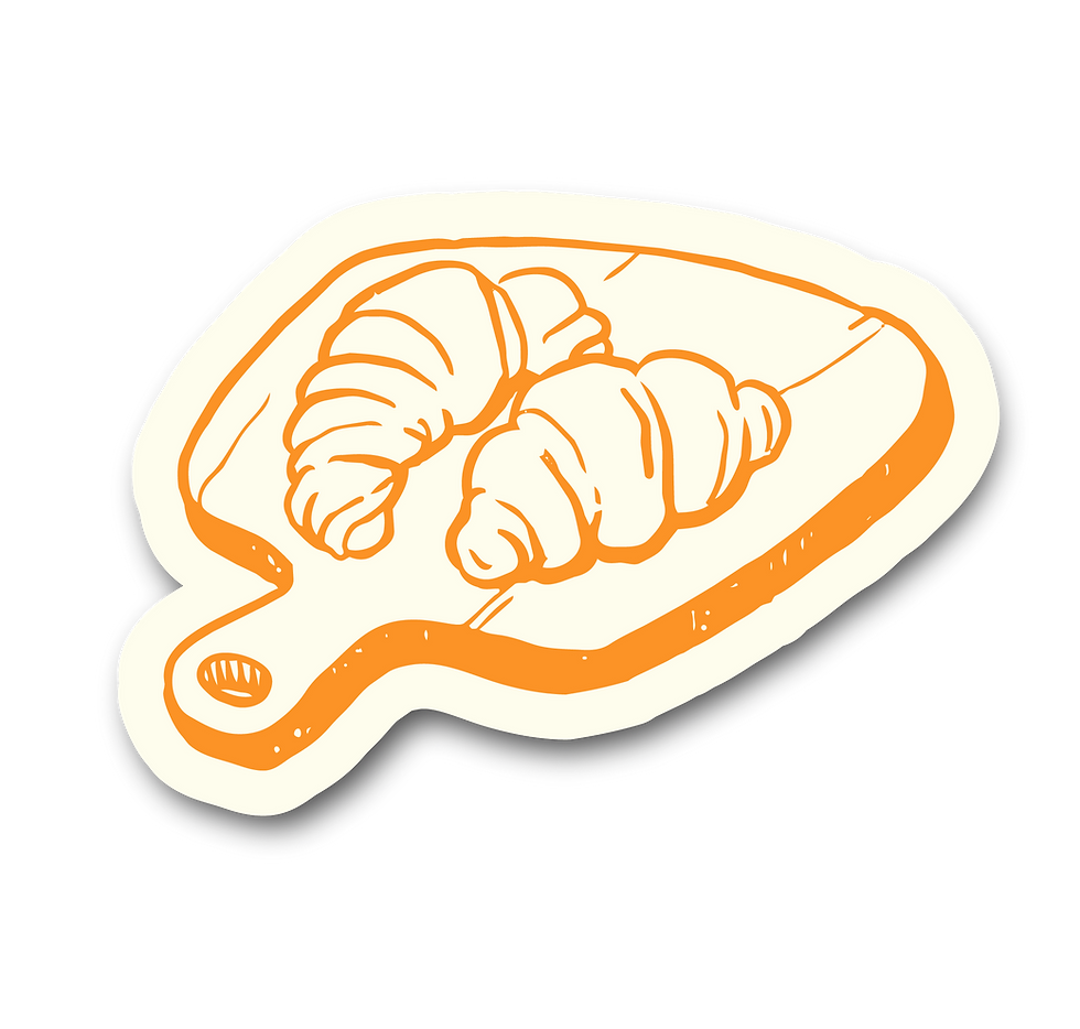
The hand-drawn illustration system adds personality to the brand while making it easy to highlight different parts of The Dip Joint’s menu. Individual illustrations can be mixed, matched, and expanded over time to represent coffee, breakfast, sandwiches, sauces, and other offerings. Designed to work across packaging, cups, labels, menus, signage, and merchandise, the illustrations give the brand a flexible visual language that can continue to grow with the restaurant.